


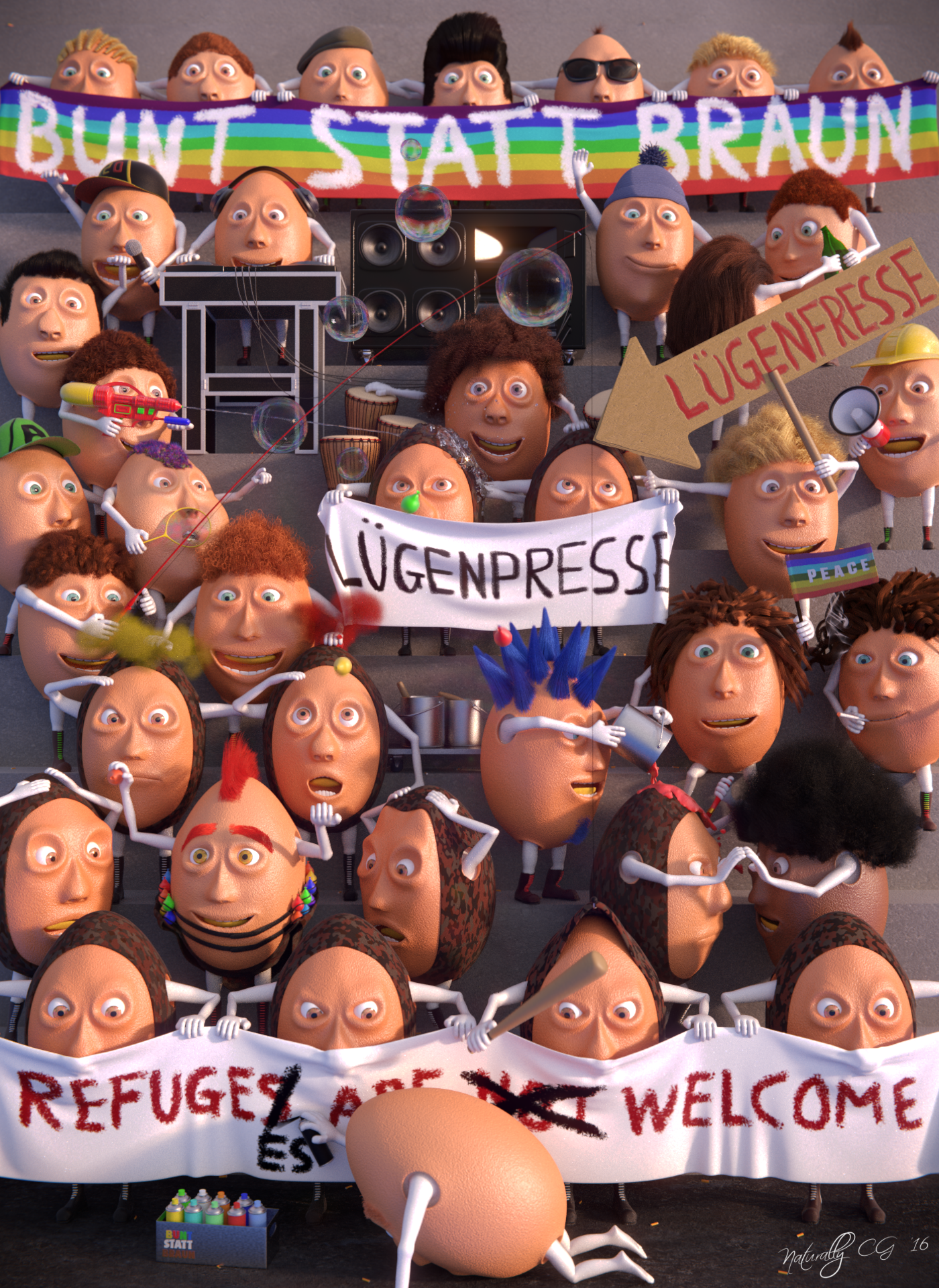
Bunt statt BraunThis is my newest artwork "Bunt statt Braun". "Bunt statt Braun" means "colorful then brown" in a word to word translation. The background story of this slogan is about one of the darkest decades in history on our planet. In and before the second worldwar the nationalsocialists in germany (NSDAP) had multiple organisations. The "Sturmabteilung" (SA) was a part of them and they had also an organisation for the young people called "Hitler Youth" (HJ). They had all some brown jackets as uniform and get called the "brown shirths". To make a statement against racism and fascism the slogan "Bunt statt Braun" was born. |
The two other german slogans in my picture are "Lügenpresse" and "Lügenfresse". Lying press is the translation for "Lügenpresse". "Lügenpresse" has the origin in the middle of the 19. century in the german speeching region of europe. It was used in multiple context and was most popular in the first and seccond world war. It described the press of the enemy states from the position of Germany and Hungary and the assertion of a control of the press by a "world jewry". "Lügenfresse" is just a synonyme for a person which tells lies. |
 |
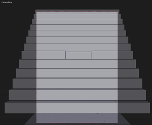
Project-descriptionIt begins like every other project with the idea and a concept. The idea i had a long time ago, because the situation about war, refugees, racism and fascism is actually the worst since second world war. So i decided that i will do a picture over the actually situation. I begann with that project 6 months ago with some long breaks. My drawing skills are not the best so i create the concept mostly in my brain. Sometimes i also draw a concept with really rough amount of detail, just to find a good perspective and where i want to place the main part and focus (learn digital painting is another process i start at moment). After the concept process, i go over to Blender and delete the cube and the lamp :) I switch to front view and placed my camera with Ctrl + Alt + 0 Numpad. Then i began with the ground, that i get a early rough look of my scene. |
 |
|
If i enjoy the position of the camera, i start in making my character. For modelling i used the mirror modifier on x-axis with clipping and modelled the character in T-Pose. I pulled the knees and ellbows slightly to the front side for better working IK-constraints in the following rigging part. Rigging is one of the hardest parts in my opinion. To rig one side of the body and mirror bones over is a good timesaver. Also Bone names are important to mirror the names correctly over. The right leg bone i call for example leg.R. Then i can automatically also flip the names of all bones after duplicating from one side to the other. All the face parts i've rigged over shapekeys and drivers. |
 |
|
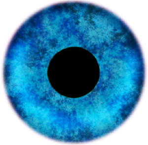
The eye texture i've done with Gimp 2.8. The reason for an egg as character had also a deeper sense. Eggs are like the most humans, also hard outside and really soft inside. They have different colors and they are also really vulnerable . By the way they have no brain(unless they are not hetched), and many of the humans don't use the brain, ;). The hair process i was doing later after placing the characters in the scene. Also the clothes i've done later. After rigging the character i placed them into the scene on different render layers for viewport speedup. Because over 30 characters (many of them with hairs) are a lot of polygons :). It is important to have a concept of what they should do in the scene, to let space for objects. It is also good to know which characters interact with others and where bigger groups of characters are. A really fun part of the process is bringing life into the scene. To make an image interesting it should looks natural with many different poses and objects. |
 |
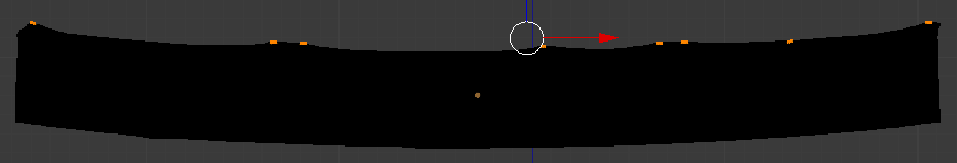
I began with the big banners because they take a lot of space and a big part of the character is behind the banners. Before i loose to much time in pose characters which are behind the banners, i placed the banners rough and then i could place the hands and pose of the character (I also know better where i need to do shoes and which parts are anyway not seen at the end). Before i began with the simulations, i've unwrapped the banners to texture them. It is important to do it before because of the deformation when making the cloth simulation. After that i've done cloth simulations with some pinned vertices (done with Vertex Groups) at the location of the characters hand. I had exactly in my brain where i would place which kind of character, so i brought them rough into their poses.
Then i start to modell all the objects and clothes. I looked for different styles to bring variation in the picture (different length of shoes, different shoes, different colors of shoelaces, unique caps and hats and much more). To have less polygons, only visible parts of characters have shoes. For the modelling part i've used a lot of different modifiers to save time and speedup my workflow. Mirror, Solidify, Displace, Subdivision, Curve, Array, Screw and Smooth are the most used in this project. Before i was going over to the texture process, i placed them into scene. To texture all the objects i did a lot of different materials (two are from the Cycles Material Vault). For the end result it is also important which color you take. I play often arround to look which color-value is the best and sometimes after render it a few times, i've total different colors then when i was starting. It's really important to testrender the image again and again, to look into details. Then follows a really interesting part. I've done near to 20 different haircut and styles. It is really interesting and blender's hair particle system is just awesome. I've done several hair colors to bring more variation into the picture. It's also important because we all have slithy different hair colors and this looks much more natural and stylish also in a not photorealistic render. At the end i've done the last few simulations for the smokeballoons, the water gun and the painting colors. |
|
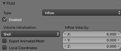
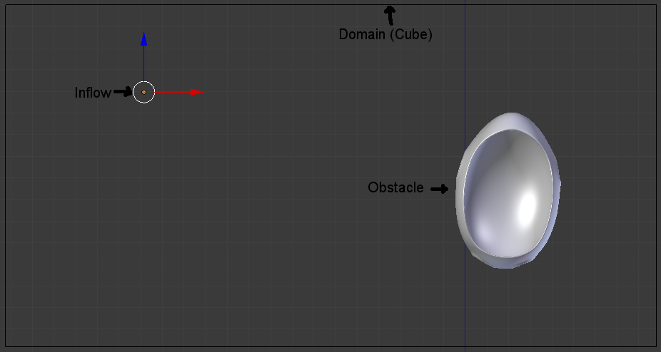
For the fluid simulation i've used an inflow object, the cloth as an obstacle object and of course a Domain (Cube) arround them. The inflow object is a simple filled mesh circle. It simulates the incoming water. For the initialization i choose shell because it was a flat object without volume. To get a higher speed into direction of the x axis i put the X-slider to 6. |
 |
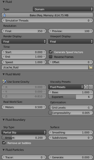 |
The Cube arround the simulation is a domain object and simulates later the water and the cage arround the simulation. It is good to make the domain not to big because it needs more time to simulate. I've used a final resolution of 350 without some subdivisions. The most settings are default settings. After the baking process i've used a smooth modifier to smooth it out and get it more natural. |
|
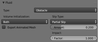
For the cloth i've used the type obstacle. The fluid collides then with this object. |
 |
|
I controlled all my settings and clicked on the Bake button. To controll where the bake-files get saved you can choose a folder under the Speed and Offset slider.
After i've baked them, i've applied the fluids, to adjust the size of the drops in Edit-mode and also the size of the whole object.(Blender's fluid system does not work so good with to small objects). For the smoking egg, i've took a 2D-image texture, licensed as CC-0 from pixabay.com. I like pixabay because i can find so many different textures or photos to use in my projects. To see an effect after activate later Vector Blur in compositing, i've animated the fast moving parts in the scene (hands, balloons, etc.). For the lightning of my scene i took Pro Lightning Skies. It's awesome to test fast different light setups. For this scene i just used a HDRI-Map for the lightning. Before i've done a first testrender from my whole scene, i checked the camera again, adjust the limits for DOF, checked the render passes and activate vector, Z, and AO passes, checked resolution and samples. Then i've done a first testrender. After that i've adjusted the colors and corrected the failures i found after looking into every detail. Then, i've rendered again to start with the compositing. In every project i play a bit arround with color management in Scene-tab, it is a cool way because you can test fast many different colour settings without waiting a lonf time to see the changes. For this image i put exposure a bit higher, bring a bit more red into it and a bit more contrast. Everything in color management. I've done a small compositing with some defocus, vector blur, glare, fog glow, shadow, contrast, lens distortion, lens dispersion, and also a small vignette. Software- Blender 2.77 Artist- Martin Schmitter References- pixabay.com |

| back | forward |
